CASE IN BRIEF
I was the main product/UX/UI designer behind Doktor.se, a Swedish digital healthcare product that scaled to over one million users. As the product matured, other healthcare providers began reaching out to collaborate. One of them was AniCura — one of Europe’s leading veterinary groups with 250+ hospitals — looking to bring digital care to pet owners.
The core UX foundation was already established through Doktor.se (the detailed UX reasoning is here), so while I adapted flows for the veterinary context, the real design opportunity here was not structure — it was emotion and identity.
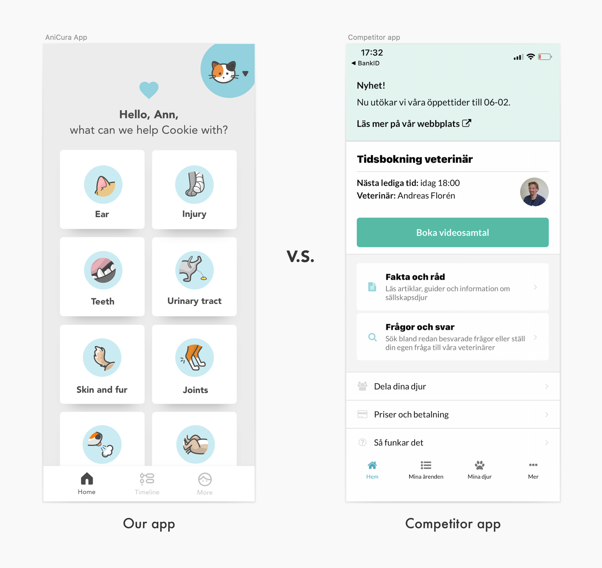
While the competitor app seems purely functional and clinical, I wanted to design a product that feels warm and builds a love relationship with the users.
I believe this will drive adoption and retention.
A real story
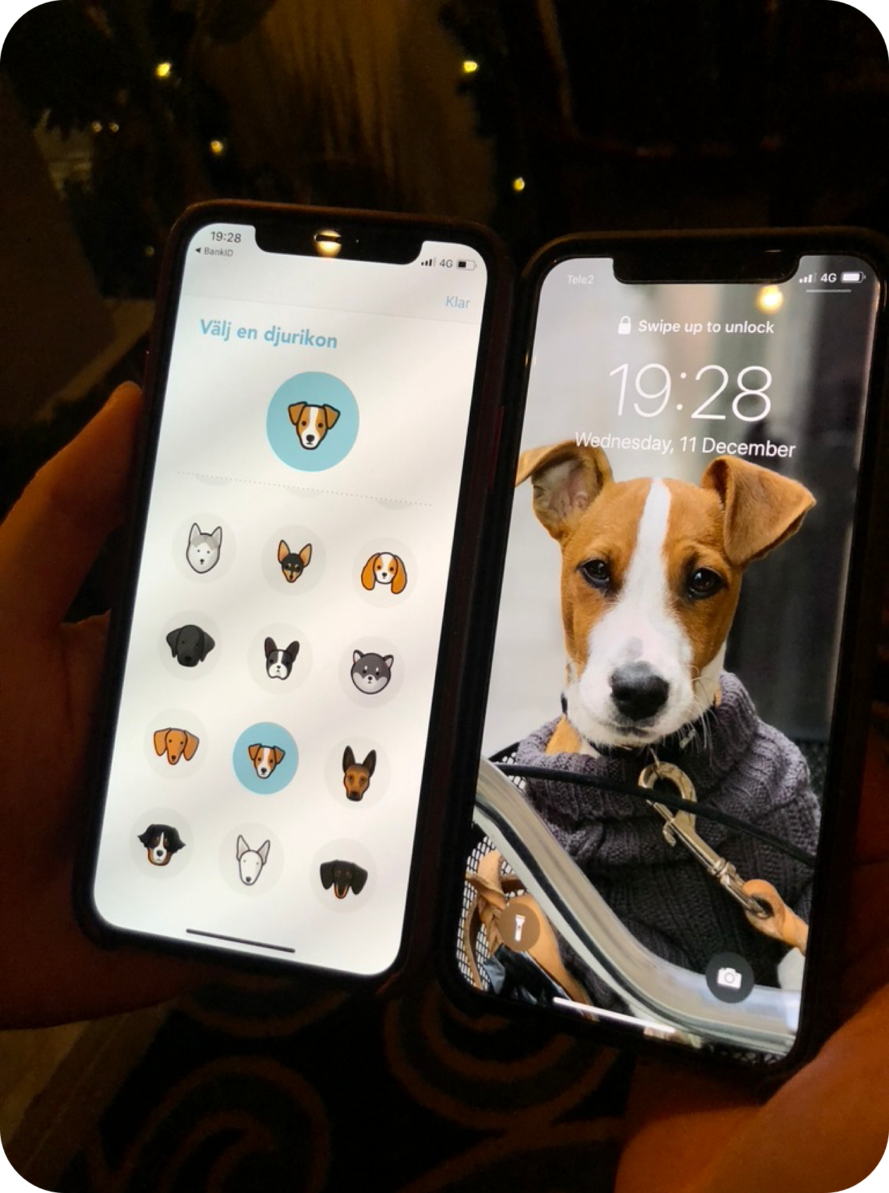
When I was at a party, I saw a friend had her dog’s photo on her lock screen, and it looked just like the icon I had drawn for this breed.
When I showed her the icon, she gasped, “Wow, which app is this? I need to have it!“ and went on to install the AniCura app right in front of me.
This is what I meant by “identity brings adoption“.
This is the photo we took at that encounter:
The psychology behind the icon design
Psychologically, a strong pull for loyalty is identity triggers.
Pet owners don’t just love any dog or cat; they love their dog and cat.
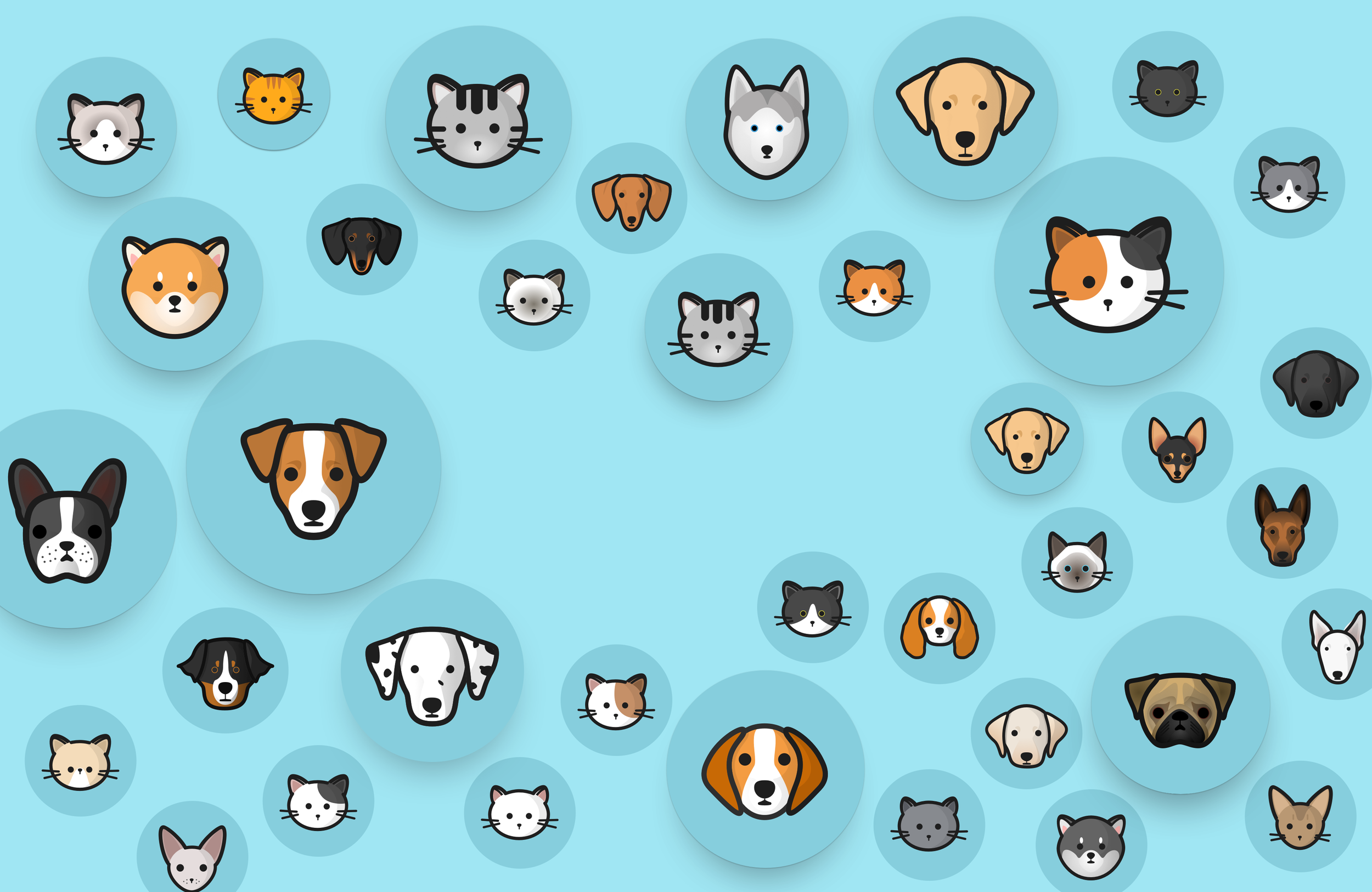
That’s why I focused deeply on the icon system.
Each icon was carefully designed so users could find one that resembles their own animal. When that moment happens — “this looks like my pet” — something shifts.
The product stops being a generic service.
It becomes personal.
It becomes their pet’s app.
This is not just visual design — it’s identity.
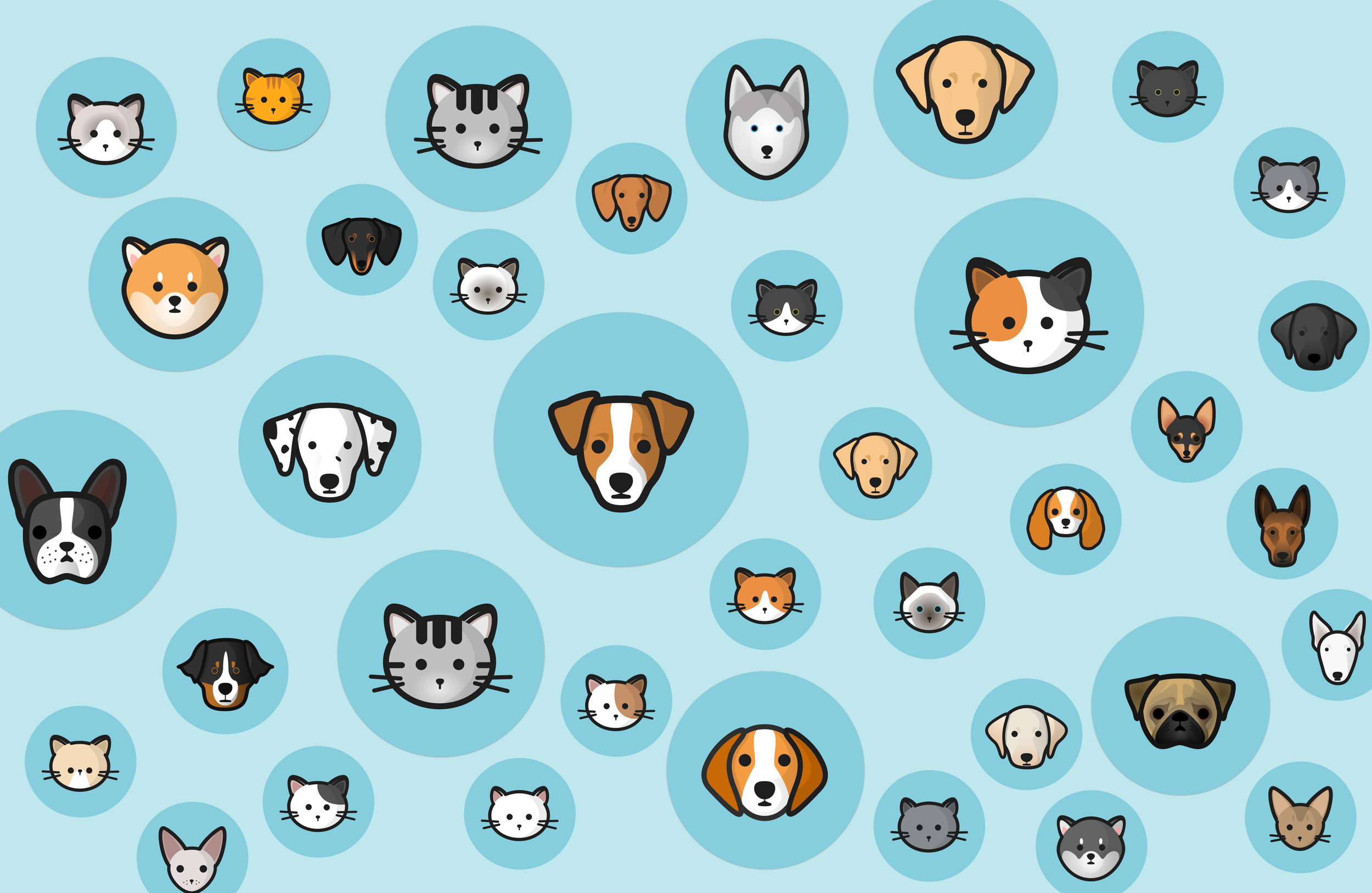
✍️ Each pet icon was painstakingly hand-drawn. I wanted it to have enough details but not too many, so it is still generic enough for an icon.
For example, I only used black dots to resemble the eyes, but went to great lengths to draw the shadows of a dog’s face for it to look 3D.
There is another subtle but important choice: expression.
I intentionally designed them to look slightly unwell. Not distressing, but just enough to signal vulnerability. The goal was to gently trigger care, so the users want to help their pets by talking to a vet.
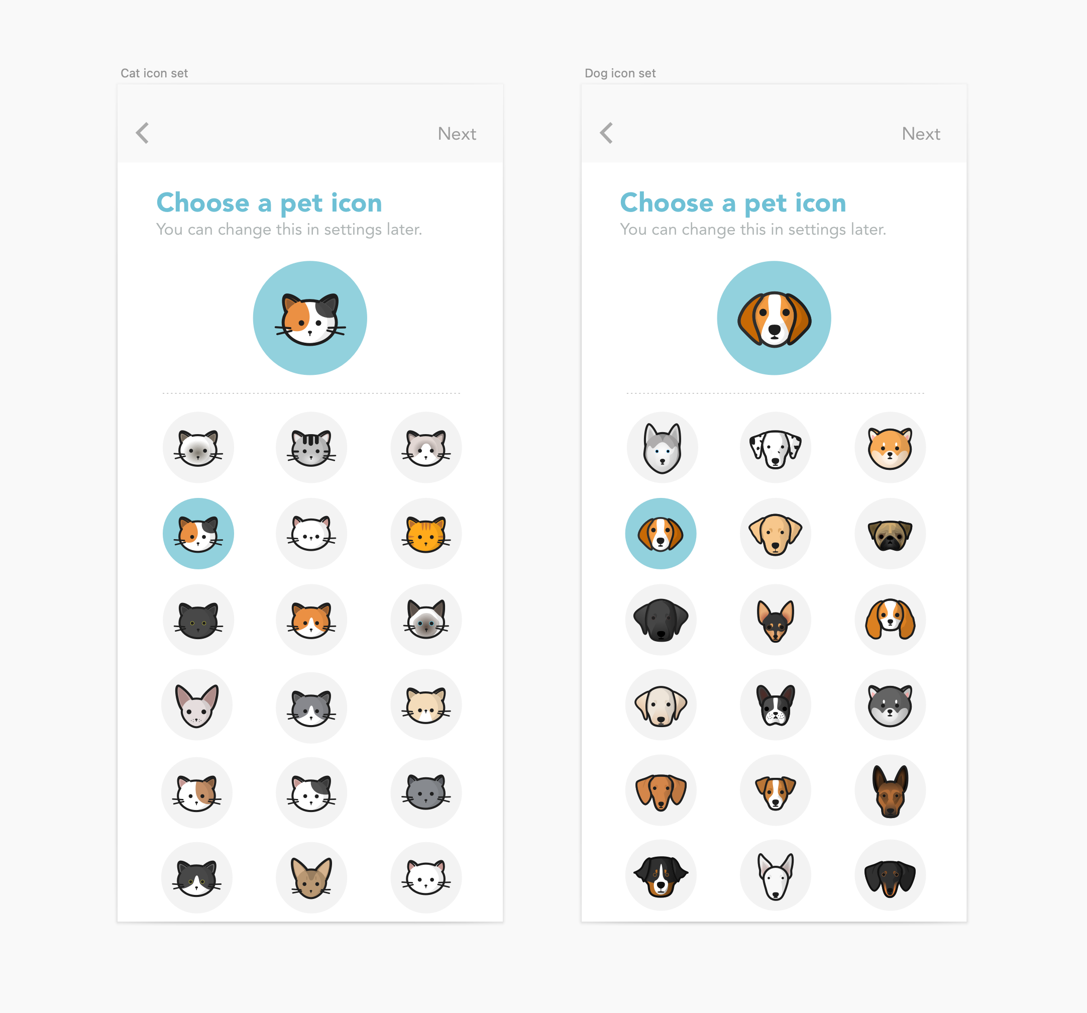
Set a pet icon for your own pet
(There are generic cat and dog icons for any breed that’s not here)
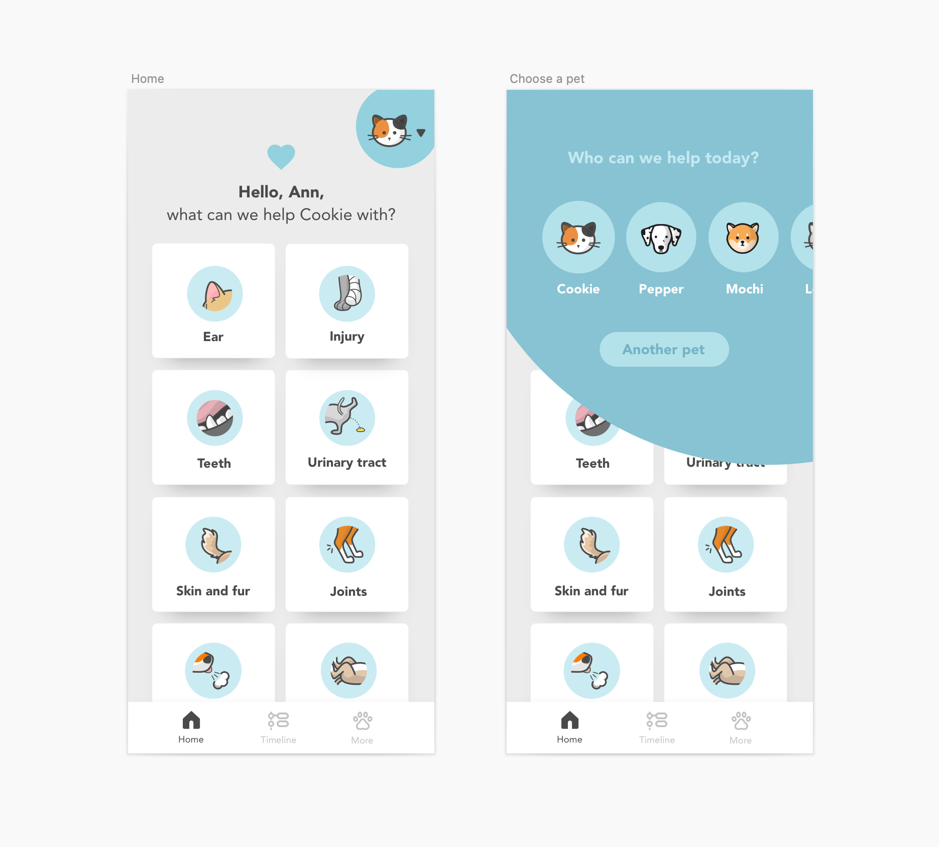
Choose a pet profile
When people have multiple pets, they can create multiple profiles.
The icons also make the UX clear and simple.
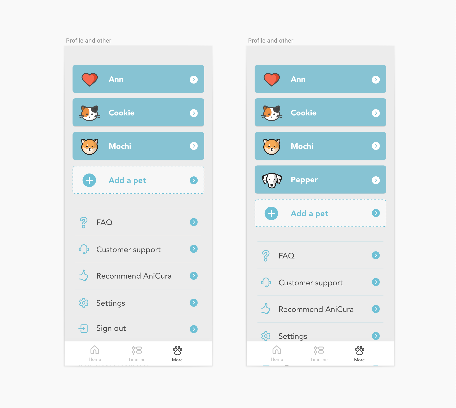
Manage multiple pet profiles
The icons make the app feel personal throughout
Designing for empathy
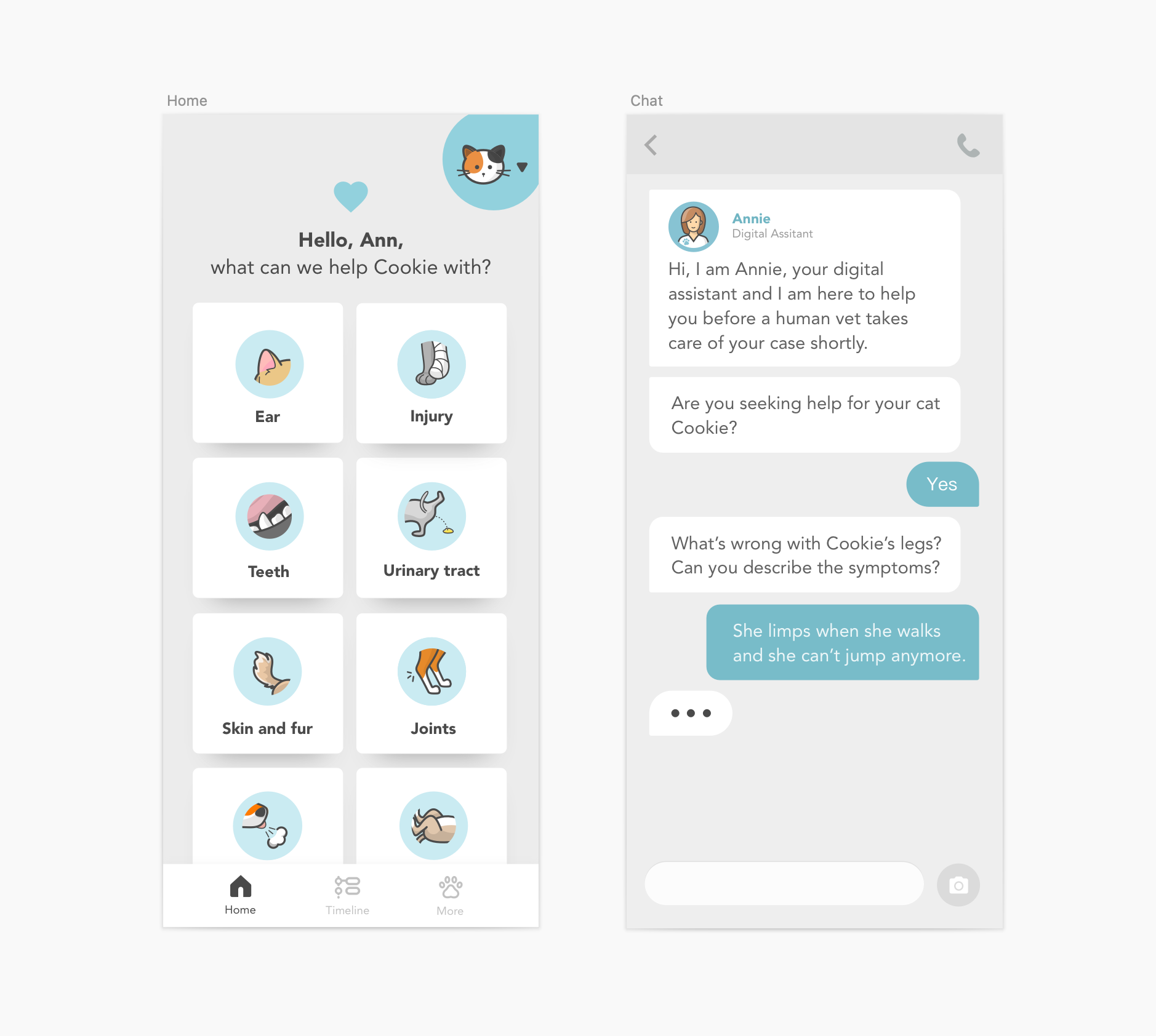
The symptom icons are the first thing you see, and they carry more weight than they seem.
In today’s mobile patterns, structure is largely standardized. The real opportunity to express personality, care, and identity often lives in the icons.
I put particular care into designing these symptom icons. I wanted them to gently reflect discomfort because:
You see the symptoms →
You feel their discomfort →
You want to take care of it by seeking help from a vet
The icons are designed to quietly bridge that gap from empathy to the decision to act.
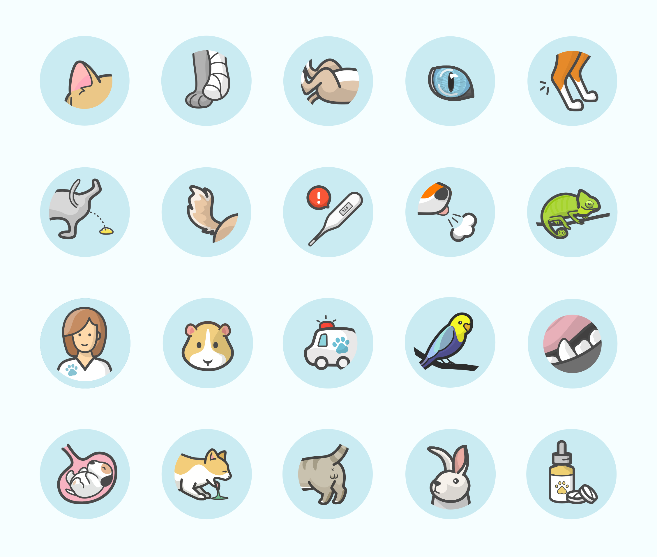
The whole symptom icon set
The icons become the “soul“ of the UI design
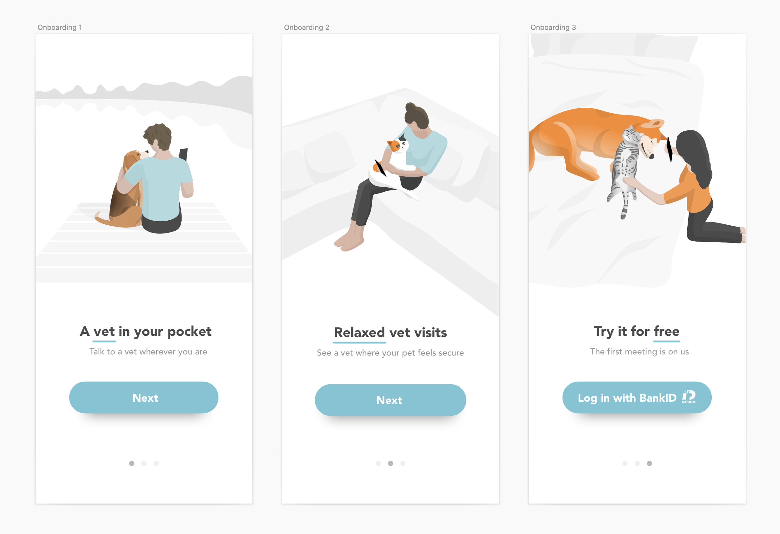
The onboarding screens that show the love relationships between pets and their owners
What this design does
This UI is not just about aesthetics.
It builds:
emotional attachment
trust
a sense of responsibility
In a product where services are largely similar, feeling becomes the differentiator.
Read more:
The design that fueled hyper growth – The design process and UX decision-making behind designing Doktor.se’s entire product ecosystem, from its early startup days to Europe’s No.2 digital healthcare app (valued at $680M)