
Ai-native patterns will not come from prompting
AI will generate interfaces from patterns it has seen. It will remix, refine, and accelerate. That is genuinely powerful, and I use it every day.
But the next era of product design isn't about remixing. It's about inventing the interactions that feel native to AI – experiences that couldn't exist before, for human needs that weren't possible to meet before.
Those patterns don't exist yet. They won't come from prompting tools.
My edge is product taste from first principles — rooted in psychology — and inventing patterns that didn't exist before, which is what I believe building AI-native UX requires.
If we go back to the first principle, it is always the human behaviours that drive the metrics that matter: retention, adoption, conversion, and trust.
My process always starts with the same question: what do the users need to understand or feel to achieve the end goal?
Below are 4 UX/UI invention examples:
1. The character queueing widget that lowered churn and protected app rating
Waiting in a digital healthcare app feels unfair and invisible. I didn’t redesign the queue. I drew the people in it — pregnant women, parents with children — so patients could see their fellow humans and feel empathy instead of frustration.
Patience went up. Churn went down.
No AI tool would suggest this. There was no precedent.
2. Contextual linking – an API reference UX design for Spotify that Apple and Google don’t have
Contextual linking — Developers reading API documentation constantly lose their place, moving between reference and code. I designed a two-way live link: click either side, and the other follows. Apple, Google, and Stripe don’t have this pattern.
It emerged from watching how developers actually think, not from looking at what other portals had done.
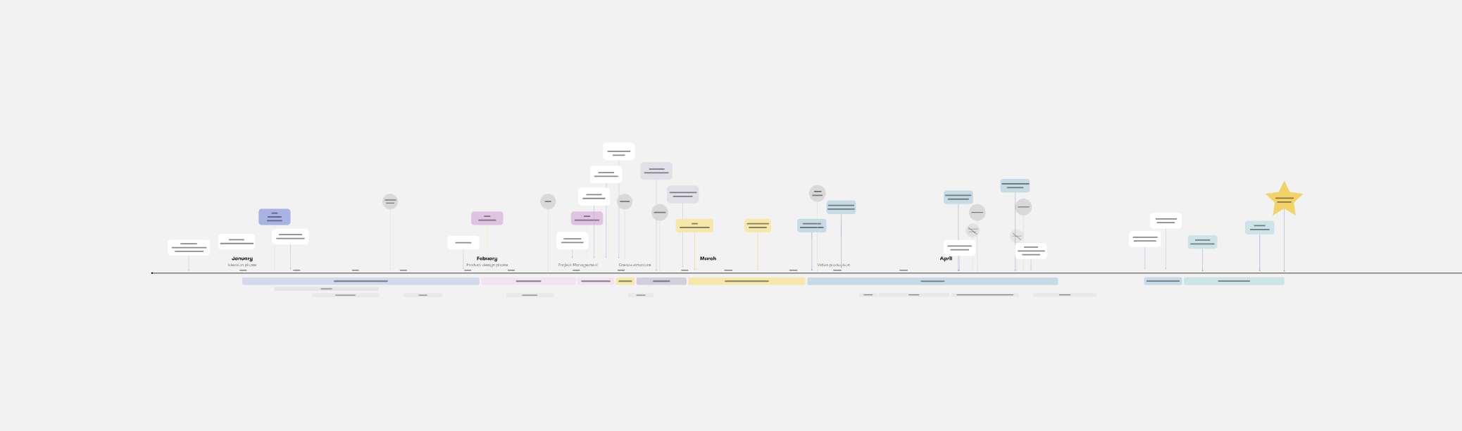
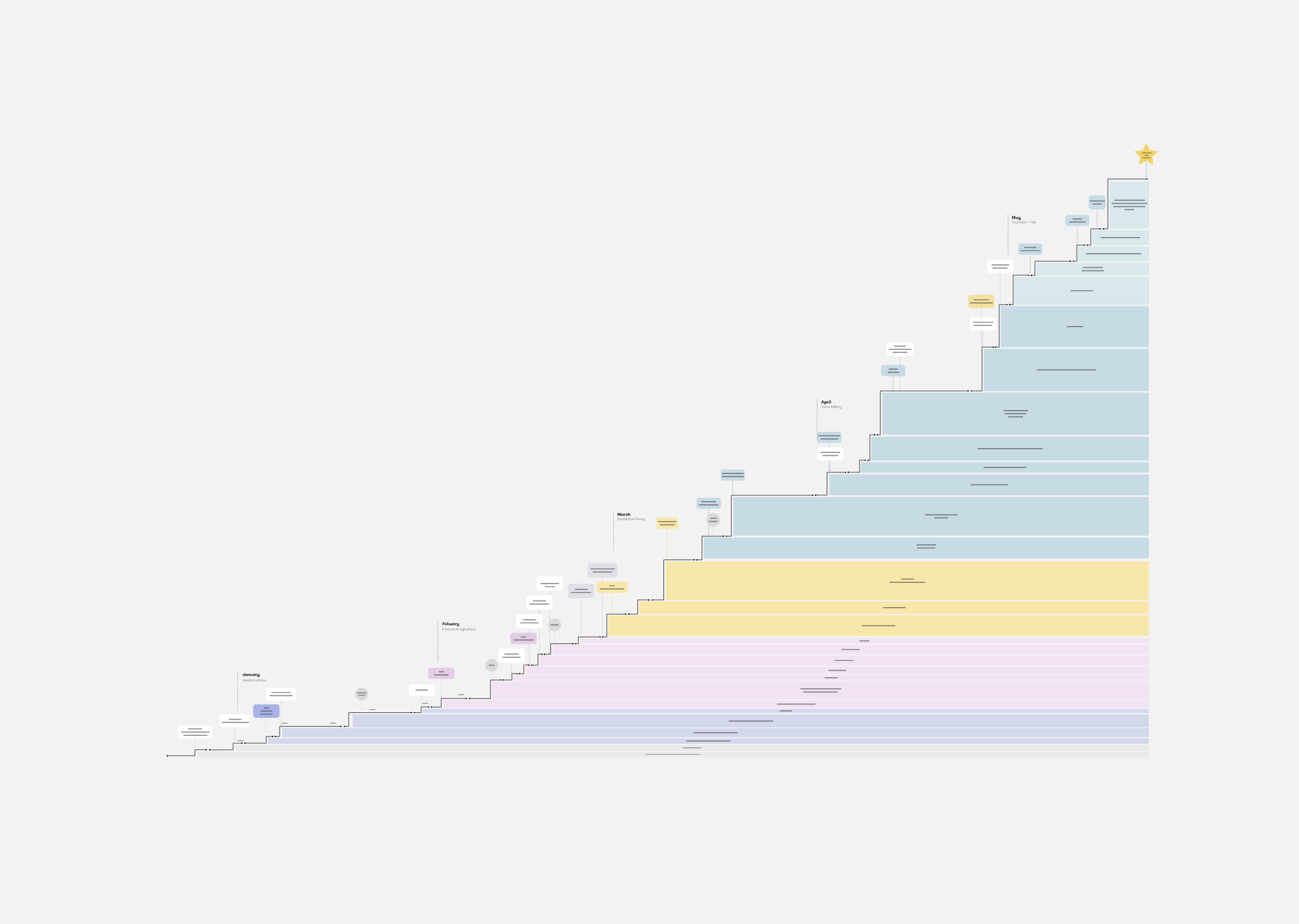
3. The mountain graph — a graph that motivates effort and action
Project progress is always shown as a timeline: milestones on a line (as below).
But a line doesn’t show meaning — it only shows sequence.
I invented a mountain graph instead, where every small win is stacked as a load-bearing layer. It’s far more motivating because it shows why each step mattered, not just that it happened.
Again, no AI tools would suggest this, because it had not been seen before.
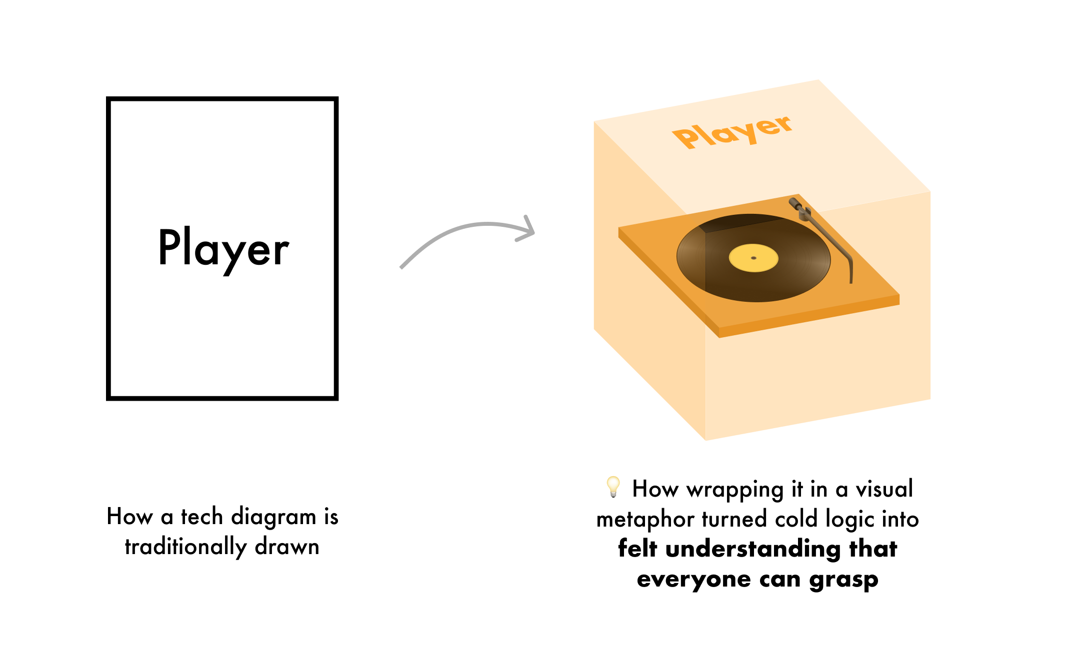
4. The Spotify video – turn complex data into felt understanding
A groundbreaking video that brought 17 years of engineer-only knowledge, made legible to every stakeholder in 7 minutes.
The key was refusing to draw rectangles. I drew 3D boxes you could see inside — a vinyl player.
When you can see what something is, you understand how it works. The video went viral company-wide and changed strategy.
the next era of product design isn't about remixing
In a recent Anthropic product design job ad, it says, “You're rethinking the basics. Many UI primitives were designed for a different era. You're excited to question fundamental assumptions and invent patterns that feel native to AI.“
The AI-native patterns will only come from going back to first principles, finding the right metaphor, and building something that makes people say: “Of course. Why did we ever do it the other way?”
That's what I bring. And AI helps me build it faster than ever before.