
Background and impact
I was the sole designer–PM behind Doktor.se’s first 1M users (10% of the Swedish population).
I built the entire product ecosystem end-to-end — from product definition to UX, UI, and system design — compressing the full design process into a single, fast decision loop, supporting the company’s scale to $680M.
I delivered the same scale of work as the main competitor Kry’s design team with tens of designers, saving the company millions of dollars a year in headcount.
This case shows how I apply my 3-step design framework to turn ambiguity into clarity, direction, and decisive product outcomes.
TRAILER VIDEO
DETAILED UX REASONING based on my 4-step design framework
1. EYE ON THE END GOAL
Whenever I design a new product, I need to find a keyword to be my “north star”, which can guide me through the countless iterations and hard trade-offs along the way.
The Doktor.se app is very straightforward – it provides healthcare consultancy through chat, audio, and video conversations with doctors and nurses. Since the users only need the app when they are feeling down and sick, the app should provide a service that is as smooth as possible so we don’t add to their agony. It was quite quickly that I landed on the encompassing keyword for the whole product – “PAINLESS“.
This app is for the masses, so from the very beginning, I aimed to create a product that even a non-tech-savvy-70-year-old can use confidently without fear.
Example:
When I joined the team, there was a “place holder” app already that brought in a few hundred users. At first glance, it looks easy enough for the straightforward functionality, yet when I stripped it down to bare wireframes, I find it extremely painful – there is no ground for the users to base their decision on whether they should “call“ or “chat“.

It took a paradigm shift to land on the decision that we should let the users begin with choosing a symptom. When the user comes to the app, the need is already clear – whether it is a headache or fever – so the most majority will be able to choose a category without hesitation. On top of it, the ease of making a choice will give them satisfaction, and the action of choosing will also lead them into using the app more.
Now looking back, this decision even seems inevitable but it is not. This is not how all the competitors have designed theirs.

After the UX makeover, I also applied UI makeover with customized icons on big tiles in order to enhance clarity and ease, the cognitive power needed to use this app is reduced significantly, and the app becomes more “painless“ to use.
(I will talk more about the icon design in later chapters)
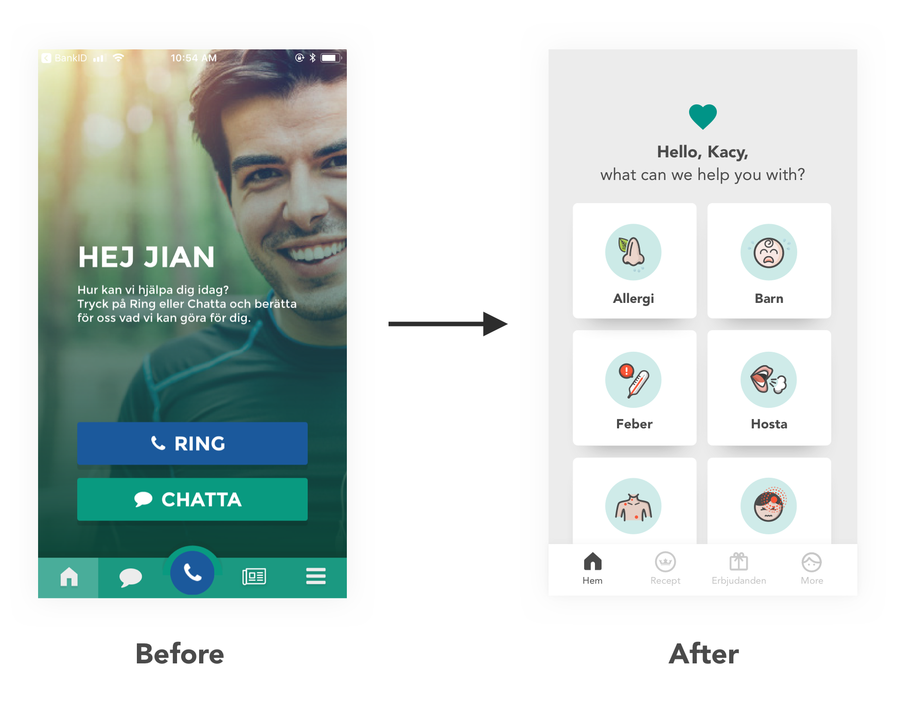
The app rating jumped from 3.5 to 4.7 right after the makeover, even though the medical service itself stayed the same.
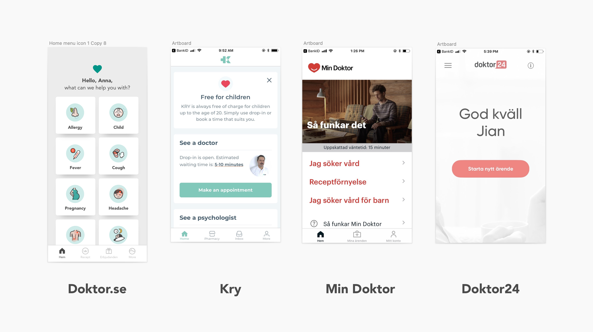
Compared with the competitors after the release:
2. HOLISTIC APP DESIGN
Elegance is another keyword that runs through the product design like a red thread. Simplicity is the key factor for achieving elegance, but on top of it, it also requires high functionality. Whenever it makes sense, I always want the product to be organically packed together, instead of introducing website-like tabs and layers. I want the app feel wholesome and simple.
Example:
A key feature that brought the app’s elegance to another level and tied the whole product into a seamless whole, is our chatbot.
Before a patient gets to talk to a doctor, we always need to know a lot of the background information first – if they have a fever, then we will need to know how long they have had it, what temperature they have, and we also need to know their general health such as if they have allergies. These questions are extensive. A lot of times, the user has to answer more than 30 questions before their errand is ready to be sent to a doctor. If a doctor has to perform this check, it would be a huge waste of resources for a country that has a shortage of doctors like Sweden.
Chat is such an elegant interface – we all know how to chat, and we can easily chat 50 lines without feeling heavy, which is different than filling a form that runs through 50 screens. It is also highly functional – there is flexibility in designing different lengths and types of questions, besides, we can add human elements such as encouragement and expectation management to the chat to make the conversation flow smoothly.
When it comes to the chatbot design, the major UX workload falls on the tasks of shaping the persona and personality of the chatbot Elsa, which I enjoyed it tremendously because it is an area where understanding psychology really matters.
For example, when we need to ask another batch of long questions, we manage their expectations by wrapping the section with “We also need to know a bit more about your general health. After this, a doctor will take care of your case.“ – communicating with a “why“ makes the users more committed to answer all the questions.


After chatbot Elsa joined, the app’s UX becomes streamlined – log in, choose a symptom, chat with the bot, reach the doctor. It is so simple and easy and a 10-second TV ad is enough for showing the major flow. It is also chosen to be white-labelled for other digital healthcare companies around the globe, such as Europe’s top vet chain AniCura and the biggest digital healthcare app in Brazil: VivaBem.

The world-famous designer Dieter Rams said: ”good design makes a product understandable”.
What really delighted me is that one day my 70-year-old friend called me: “Gu, I am NOT intimidated by your app. I know exactly how to use it!” I was so overjoyed by her feedback - if someone who is normally scared of technology can feel total confidence in using the app for the first time without additional instructions, it is the hallmark of a product made understandable.
3. DESIGN FOR EMOTION
I believe the best kind of products don’t just solve problems, they build love relationships. Great apps are not just the fruits of useful functionalities, they are the triumphs of psychology.
So how do you build a love relationship with an app?
First, how do you build love relationships in life? We build love relationships with friends, partners, kids by loving them. We show care. We show consideration. We use our love languages to show love to them and hope they will love us back. That’s how love is generated in our lives.
When it comes to product design, it also starts with loving the users – feel their feelings, treat them with the ultimate care and respect, nurture them, handle them with care, try to be as considerate as possible. Then hopefully they feel cared for, they start to feel attached to the product and they start to love us back.
Example 1: Waiting Widget
It is easy to understand that when you have a service that has limited staff to deal with unpredictable surges of demand, inevitably people will have to wait sometimes. But waiting is painful, especially in a space fuelled by instant gratification. When people have to wait for too long, they can feel angry. In the world of apps, anger means deletion of the app and also bad reviews.
The interesting thing about our pain is that there is more than one way to solve it. If we can’t remove the cause for pain by shortening the waiting time, then let’s apply some design magic to ease the pain psychologically. We arrive at the same destination – less pain.
So instead of just giving the users a queue number, which gives people a rational understanding of how many people are in front of them, I drew the characters to represent the people that are in front of them – they will see there are pregnant women, there are people with kids – which automatically activate people’s empathy and they become more considerate to their fellow human beings: “there are people who are in bigger need than me. I am a good person, so I will be patient and I will wait.”
When the users’ higher their patience, their pain of waiting will decrease. These characters are not trivial, they serve a critical function as to make the app more “painless“, which results in less churn and higher rating.

Example 2: Icon Design
By “painless”, I don’t only mean the UX to be as easy and self-apparent as possible, I also mean the UI should largely enhancing this feeling. Visually, I want it to be soothing and calming, making it feel easy and simple, which led to the decision of creating 100% customised icons.
When the interface designs are constrained by the simple mobile design patterns, one of the few places where you can inject emotions, humour, character and personality is the icons. These are for medical care, so I need to make them describe the pain but not too painful to watch. It should show the symptoms but not be gross. Something relatable but also loveable.

The crying baby icon is the first icon I have ever designed in my life. At the beginning, I was wondering if it is ok to show a crying baby because it shows pain, and I aim to make the app painless to the users. But later on, I realised that the “physics” of pain is that the more we keep it a secret, the more it festers. The more we talk about it, it dissolves. So it is actually good to show pain in the icons and the users can even be soothed by our acute understanding of their experience.

Let’s take the insomnia icon as an example: when you have insomnia, 4 am is the toughest time to awake – you are gonna get up soon but it is also too late to take sleeping pills. It is 4 already so you have been struggling for long enough and you are probably very frustrated…
What I strive to achieve is a high level of “humanness“ brought by the emotions conveyed in the icons.
THE product ecosystem
When the app redesign was completed, I was also given the task to redesign the entire set of desktop software that doctors, coordinators, and the management use, lifting the whole business to a new, streamlined level.
The digital systems in the healthcare world famously lack care, love and style, and I set out to change that in my designs. I strived to achieve Slack kind of ease, beauty and delightfulness.
When the internal errand handling system Carealot I designed was released, the then head nurse, who had worked as a normal nurse first and moved her way up to manage other nurses, liked the new system so much that she said: "Ha, maybe I should be a nurse again".
Doktor.se has had more than 1 million registered users, which is more than 10% of the entire population of Sweden. It makes me proud to think that my designs of the apps and internal software have helped the nurses and doctors to serve so many people in need.
REFERENCE:
”Gu is a spreader of ideas and happiness wherever she goes. Put an idea or project in her hands and she improves it and packages it into something meaningful and comprehensive. With strong communication skills she motivates her thoughts and decisions. Gu is devoted and delivers quickly and I would love to work with her again in the future.”
- CTO Peter Alvarsson,who is the former CTO at Storytl during their journey of becoming a unicorn
Read more:
THE PRODUCT DESIGN PHILOSOPHY I BUILT MY ENTIRE CAREER ON – A five-part product design philosophy developed while founding Instabridge (250M+ downloads) that continued to prove itself across industries, products, and changing tools
THE FULL INSTABRIDGE STORY (LONG READ) - A detailed and honest story about the Instabridge journey: the challenge, the approach, the solution, the reflection...