
earning the crucial first million users for a viral app by completely revamping the product design
*This is a long read, but you can also skim it through by only reading the bold texts
BACKGROUND
Instabridge is an app that gives people free wifi by crowdsourcing wifi hotspots. It is a popular app with more than 250 million downloads today, but from designing the product from an mere idea to finding its first direction for real growth is quite a journey.
I met the founder Niklas at the first hackathon I ever joined. After he had pitched me the idea for five minutes, I loved it so much that I already decided in my heart that I was going to ditch everything else I was doing and join the team. At that point, the company was only one month old.
The original team of five started off passionately from our kitchens. We had our fair share of unpaid 14-hour work days, made 3 versions from scratch, learned a ton along the way, but 2 years later, we still found us puzzled and frustrated by the hard truth that we were not succeeding with our free app giving people free wifi. Shouldn't this be a no-brainer?! None of the versions brought in significant traction, our users didn't really get the app, and we only had 6 months of runway left.
I took the lead for product design and was responsible for designing the last iteration before our money ran out. We couldn't admit defeat yet, we still loved the idea and we still believed in its potential. For me personally, I just couldn't give up before I had designed a product that I could be truly proud of.
The challenge
As long as it is a crowdsourced solution, one always faces the bitter "chicken or egg" dilemma - we needed a lot of wifi hotspots in our database in order to give the users value, but we could only get the database filled if we had a lot of users.

Obviously, the database wouldn't fill itself, so we needed to get users. In order to get users we needed to give them value. How can we give them value when the value needs to be built up by them using the app? Apparently, we needed to give them some other value than only free wifi. So, what can it possibly be?
Approach
2014 is the year when Android started to allow apps to replace their native functions. For example, they allowed HelloSMS – a much more user-friendly chat app – to replace the native SMS function. When we saw this, a lightbulb lit up – what if we make a much better wifi client to replace the default one?! This is the year before Android's Material Design makeover and I was confident that I could improve this 20 year old design big time. Our new mission became – make the world's best wifi manager, which also gives you lots of free wifi!
The beauty of this solution is that even if the user was the only person in the world using our app, he/she still gets value out of it. We would also finally manage to give our users instant gratification, which would help us to actually keep them. And app usage would go up significantly, since the users would use our app to connect to wifi every time, not just when looking for free wifi. Moreover, we would have so many more chances to urge them to share wifi and fill our database. We were absolutely energised.
Solution
STEP 1: DEFINE PRODUCT DESIGN PRINCIPLES
To define the design principles was the first step of our new design process. I always start by identifying the smart design elements in great apps, understand what made them great, and try to create something new based on similar problem-solving methods. I carefully studied tens of different apps and found myself extremely inspired by HelloSMS, Google Keep, Timely, Waze and Dots.

At a kickoff event for the team at a Japanese spa, we wrote down a whole big white board of words extracted from their characteristics plus our own. In the end, we narrowed it down to four keywords, which we would measure every design decision against, and it made it so much easier to weigh different options and make choices.
Trustworthy: It should always work as expected, if not, you should know why.
Delightful: Make it tick in the heart. (Since then, I have used this phrase again and again throughout my product design processes. Our emotions lead us in unconscious ways, and most often, we go where our hearts want to go.)
Light: Smooth, instant. Visually, this keyword weighs heavily.
Smart: Predict, facilitate, make it easy for the users.
STEP 2: TOTAL UX REVAMP USING ANIMATIONS
The previous versions were designed more like a bundle of webpages. It was what we knew best back then. But more and more, it became clear that the depth that good apps make us feel is much more like what physical products with dimension and texture do to us. When we go through the streamlined and functional flows of a good app, it feels more like turning a cube than flipping pages in a book – the change is smooth and one could see the relation between two states. So much easier to use and so much more likeable. I really wanted this feeling for Instabridge, so I decided to take a much more holistic approach and use animations to tie the product together "organically", even though this meant revamping the UX as well as my design process completely.
Backed by the full support from the development team, I was ready and pumped to make one of the least sexy phone functions sexy.
STEP 3: BUILD THE MAIN STRUCTURE
BECOME A FUN WIFI MANAGER
The old design had three tabs. Hard to make it even simpler. One thing that did bother me a lot was how heavy it felt, despite of its simplicity. After many attempts, I pulled the top bar to the bottom, which totally made the magic happen – suddenly, it feels so much lighter! And "light" is one of our design principles. This pattern became the corner stone of the design revamp.
The main characteristic of any wifi manager is to have the list of wifi hotspots. I was clear from day one that this can't be comprised, no matter how innovative we wanted to be. The users have some patience to learn things, but not a whole lot. The pain to learn something should be minimised.
By using animation and light colours, if nothing else, a completely new and fun wifi manager was created. It is already quite a depart from the "dark and heavy past".

The birth of a completely new and fun wifi manager
It has the familiar wifi list, and it also has two other sections - "free wifi here" and "free wifi nearby", which will eventually provide the extra value Instabridge could uniquely offer and enhance the users' experience. I like the way these functions are naturally stacked on top of an old function everyone knows how to use. Since users normally explore a new app by clicking around all the obvious buttons, this structure would make the app very easy to learn. To my delight, this was clearly proven during our user testings.
Speed testing for wifi is a popular function which we already knew from previous versions. The challenge here was how to embed it in the new design organically. Steve Jobs famously said "great artist steal". Here, the tab design from HelloSMS provided brilliant inspiration – when a wifi is connected, the user could swipe left to access a panel with speed test and other information.

An organically embedded speed test screen in the wifi list
Even without all the other functions I was going to add, I could feel I was onto something great.
The video below shows how the wifi list and the speed test work when it was actually implemented. (The version used in the video was on Google Play)
Kill two birds with one stone
Of course, our end goal was never just to build a wifi manager. We wanted Instabridge to be the best app offering crowdsourced free wifi globally. A beautiful side effect of becoming a go-to wifi manager is that every time people input the password to connect to a new wifi, we have an opportunity to prompt them to share the wifi, which would help us to reach our final goal.
A streamlined sharing flow was added right after connecting to wifi – the users were asked if they want to share the wifi right after successfully connecting to a new wifi, and if they choose to share with the entire community, they also have the chance to mark the venue so it's easier for others to find it.
We hoped more free wifi hotspots were going to be added to the app because sharing became part of a frequently used process, and it was proven true after the release. (The video below shows you how a wifi was shared.)
STEP 4: DESIGN FOR EMOTION
When I design, I design for humans. I want to delight them and I want them to fall in love with my product. To me, the essence of UX design is to use reward and pain to fine-tune subtle feelings in order to nudge the users to engage with the app in the way you intend them to. Great apps are not just the fruit of useful functionality, they are the triumphs of psychology.
Something extremely valuable we learned from the last versions is that we do have a fan base who are eager to contribute to the community. At the time of this design, the top user went around in his city and added more than 600 wifi hotspots in the system. At this "chicken or egg" phase, our top users' contributions just couldn't be emphasised enough.
We thought hard about what could possibly make them happy and landed on gratitude! We all know how it feels when we get "thanks you" from someone – we feel good about ourselves and possibly want to contribute more. So we designed a function to thank the contributors when you connect to a wifi they has added, and the contributors can check how many "thanks" they got on their profile.
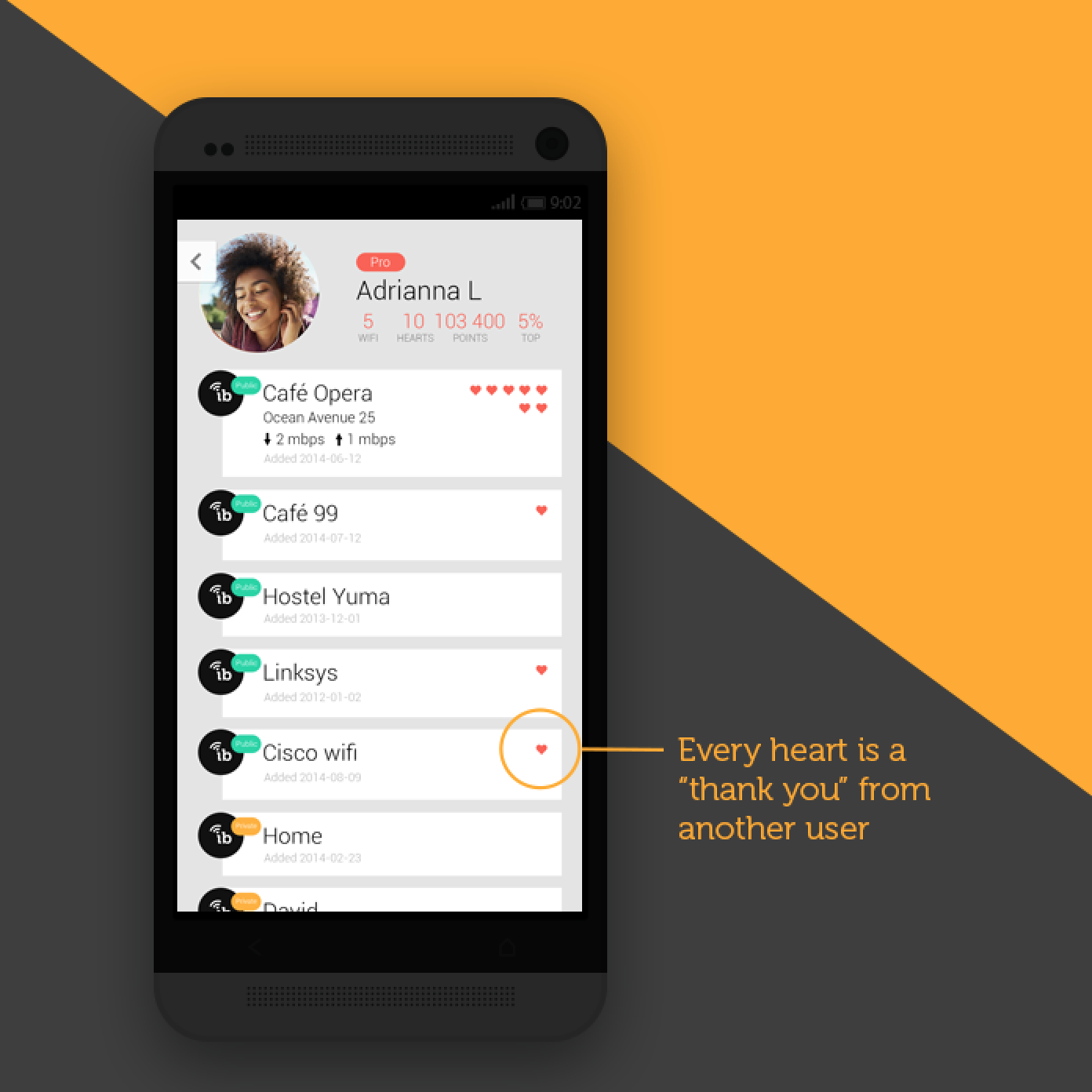
On every user's profile, they can see how many "thanks" they received from other users.
At the very beginning of Instabridge, we had an extremely painful onboarding – phone number plus verification code. Ever since then, we tried Facebook login, email login etc. Every app wants to get contact info from the users of course, when the whole industry has the same practice, one stops questioning why. But what is the end goal?
I like to talk about end goal because it prevents us from getting fixated on the means, we can look up, see the bigger picture and become much more innovative. The end goal of a login is to lock down the users, but there is a price to pay – lots of pain during onboarding, which may drive them away from the app, hence defy the purpose of having it in the first place. We make a free wifi app, not a dating app, if we don't get them to register before they see the app, so what? Only when it is pain-free enough, the potential users will give it a try. Only when they can see the value of the app, they will keep it. Only at that point will asking users to register help reach our end goal – to make them loyal users and to know how to reach them.
It is a bold move, but we decided to have a "one-swipe onboarding" in order to remove all the pain at this step – literally after only one left swipe, the user comes into the app. Instant gratification, instant gratification, instant gratification!!! Nothing is more important than this, when it comes to app product design. Removing every little bit of pain helps, adding every little bit of pleasure helps.

The first screen users see when they download the app. They can enter the app by just one swipe. No arduous registration needed.
What more can we do?
When Google announced their plan for Material Design, this sentence really struck with me: "imbue your app with a moment of wonder and a sense of superb craftsmanship".
To delight and charm, we carefully crafted amusing animated transitions throughout the app, such as these direction arrows pointing to where the free wifi is. When one turns the phone, the arrows will turn as well.
The delightful direction arrows
Instabridge has a crowdsourced nature, which means one user's actions will influence other users, hence it is a social app. When we design for emotions, we have to look into the basic components of the human psyche. We humans are social beings and our social needs are treated almost the same way as food and water in our brains. Status, certainty, autonomy, relatedness and fairness compose the five domains when it comes to human social experience.
A leaderboard showing the top contributors caters to the basic social needs of status (who is on top) and fairness (the more you do, the more recognition you will have), and it became a powerful tool to drive wifi sharing upward. It delighted the top users and encouraged more people joined the "competition". Gamification is so powerful.
STEP 5: PREPARE FOR PRESS
When the product is designed and built, one needs to tell the world about it. The story should be as attractive as the product itself. If it goes well, the graphics and videos you designed will be all over the internet. So never take this step too lightly.
I felt so strongly that the new app needs a video but I had never made a full length animation videos before. In the end, the urge is so strong that I just had to do it, even though it meant I had to learned After Effect – one of the most complicated Adobe softwares – from scratch.
I drafted the story line, listened through hundreds of tracks to find the background music, after some 200 hours (many of which were spent during weekends), the new animated Instabridge promo video was born! (The video below)

Promo video
For the press photo, I want something that showcases the product while conveying its value in one glance, so I pictured a person holding the app, looking for free wifi on the street. When I really couldn't find a picture with the hand exactly the way I want, I shot one myself with my colleague's hand holding my own phone. Then I photoshopped everything in.

The making of the press photo
Outcome
The most rewarding outcome? Our users loved the new version. It also pumped up average daily downloads more than fivefold (with the highest day being ~40K), and eventually made Instabridge pass the crucial first 1 million download milestone. The average rating for this version is 4.4, much higher than before. When we watch the videos of user testing of this version, we didn't have to bite our nails anymore – users quickly got how to use the app.


Because so many people started to use the app, the free wifi database got fuller and fuller too. It is such a satisfying feeling when one looks at the millions of free wifi added all around the world. Every dot is something a user added! (Please see the video below)
By reaching a new level of daily downloads, this version helped the company raise its Series A funding of 3 million dollars. The story was covered by TechCrunch.

Instabridge's series A funding round got featured on TechCrunch
When a viral app starts to take off, the growth normally becomes exponential. Three years ago, it was such an incredible achievement to land 1 million downloads. Today, Instabridge has already passed its 100 million downloads benchmark and is serving people from all over the world.
Lesson learned
People dream of making an app in a week and have it downloaded 1 million times the week after. (Well, that's why I jumped in this after five minutes of pitching.) But it is not how it usually goes. It even took Twitter five years to find their formula. That's why iterations are so important, and patience too. In the end though, all those years lost in the woods were essential to finding the way forward.
To be the sole product/UX/UI designer for this iteration of Instabridge was so invaluable. I got to take total ownership and work on the soul of something, which helped me get a profound understanding of why "the design is the functionality".
The solution looked so apparent in the end, but the journey there was not easy. Through all the frustration and confusion, a colossal of trials, errors and iterations, everything I learned during the process is bone deep.
When I look at an app now, I look at how they use emotions to engage their users, how the core functions are realised and how they fulfill the business purposes. It is a quantum difference between how I was as a product designer before and after.
I feel extremely grateful to have worked on this version in a team that had complimentary skill sets and we really trusted each other to do great work. Everyone felt seen and supported, and the shared mission made us feel so tight as a team.
True belonging.
Strong sense of purpose.
It was simply an riveting period of my life which will be remembered forever.
Read more:
WHAT PRODUCT DESIGN MEANS TO ME – 5 key learnings from revamping Instabridge, reaching its crucial first million downloads
NATURAL CYCLES REDESIGN - Applying the 5 key learnings from the Instabridge journey to redesign the world's first contraceptive app